THE ASK · DOORKNOCK · FIELD-OPS APP
What this case study showcases:
01 · I can test past the happy path and validate a design in the environment where it actually gets used.
02 · I can make the right trade-off: less status granularity, better field readability.
03 · I understand accessibility as real-world usability, not just a simulator result.
95%
of test participants used the map-based status system as their primary status check.
Context
The ask: make property status visible at a glance on the map.
Agents needed to quickly see whether a property was delivered, needed delivery, or was unsuccessful. The map had to work as a field tool — readable while walking, one-handed, and under outdoor light.
Problem
The three-color system passed accessibility tooling, then failed in sunlight.
My first version used three colors for three statuses. A colorblindness simulator confirmed it held up for deuteranopia and protanopia. Testing outdoors caught something the simulator couldn’t: one tester, squinting at their phone at midday, said, “I can’t tell these two apart out here.”
What I changed
Before · three-color system
Delivered
Needs delivery
Unsuccessful
After · two-color system
Needs delivery
Delivery successful

BEFORE · low-contrast status markers competed with the map
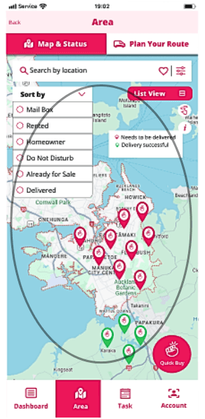
AFTER · stronger status treatment made field decisions easier in sunlight
Why change the status treatment?
Agents were using the map outdoors, often in glare, while moving between properties. The original status options were too subtle against the map, so users had to slow down and re-check what each property meant.
What the redesign improved
The redesigned treatment made statuses easier to scan at a glance, reducing ambiguity between similar states and helping agents decide where to go next without fighting the interface.
Why change “Status” to “Sort by”?
“Status” described the data, but not the action the user was taking. “Sort by” made the control more task-led: agents understood they were choosing how to view the map results, not editing a property’s status.
Test participants chose the map-based status system over the old spreadsheet view, showing that the map had become the trusted working surface for field status checks.
Why I noticed this
Accessibility tooling checks color vision. It doesn’t check glare, screen brightness at noon, or someone trying to read a screen one-handed while holding a clipboard — the kind of real-world constraint I got used to watching for in the field, not at a desk.
For hiring managers
Real-world accessibility
I validated the design against glare, sunlight, movement, and one-handed use — not just simulator results.
Trade-off judgement
I reduced status granularity because glanceability mattered more in the field.
CX context
My field experience helps me notice constraints that don’t appear in a desk-based review.